


Designing for print can be a minefield for beginners. There’s so many easy mistakes to make that can have a serious impact on the quality of your final prints. With print runs also being very expensive, these mistakes can prove very costly. Hopefully today’s discussion about common beginner mistakes to avoid will help prepare you with the crucial knowledge required to correctly set up a design for print.
KNOW THE DIFFERENCE BETWEEN RGB & CMYK
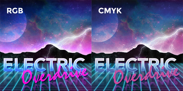
The most obvious mistake that newcomers fall victim to is the misuse of RGB and CMYK colour modes. RGB (red, green & blue) is an additive colour system where light is used to mix colours; the more light you add the brighter and more vibrant the colour gets. When working on digital designs you’ll often be working in RGB mode because that’s how your monitor works, but the problem arises when we’re creating a design for print using a RGB based tool.
CMYK (cyan, magenta, yellow & black (key)) is a subtractive colour system where inks are mixed to create a range of different hues, much like mixing paint as a traditional artist. The more ink you mix the darker the colour gets. The spectrum of colours that can be produced by light is much wider than the range achievable by ink, so our design applications have a special CMYK mode to limit the “gamut” of the colours we have available when creating a design that will ultimately be printed.
Failing to select the CMYK colour mode and instead creating your designs in RGB may result in you selecting awesome colours that just can’t be reproduced in print (without special inks). If you don’t realise this early on you’re going to be in for a surprise when your prints come back all dull and muted.
WATCH YOUR CMYK COLOR VALUES
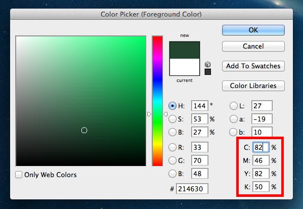
We’ve already talked about how the typical CMYK color model gets darker as you add more ink. In the printing process this is done using an offset lithographic printing press (or a digital printer for small runs). This machine lays down a coverage of the four inks of cyan, magenta, yellow and black over the same area of paper to overlay the inks and create a much wider range of colours. Tiny halftone screens determine how much ink from each plate is applied across the print.
In our design applications we can easily select colours using the color picker tool as well as ready made swatches and adjustable sliders for the C, M, Y & K values. You must keep in mind that colours that use large amounts of cyan, magenta, yellow and black will quickly become oversaturated and any total values containing over 280% coverage may result in ugly muddy colours and set-off (when the ink remains wet and transfers from one sheet to another). Our computer applications might show the colour looking fine on screen, but in reality prints always appear darker than your original design.
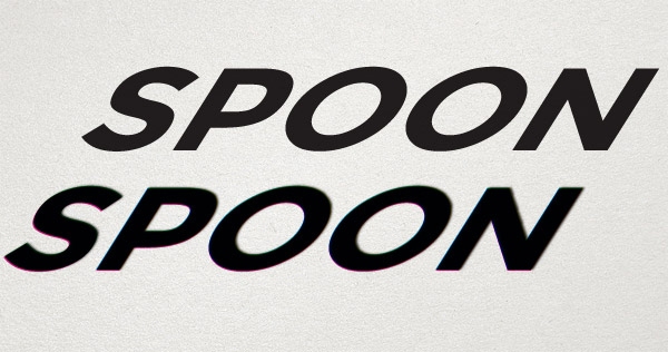
Using mixtures of multiple inks will also result in potential fuzziness, especially when applied to fine artwork such as text. If those four C, M, Y & K plates are just slightly misaligned (known as registration), your text will appear blurry and difficult to read. Perfectly sharp text can be created by using just one process colour value, so 100% K (black) will be as crisp as you can possibly get.
DON’T USE PHOTOSHOP BLACK
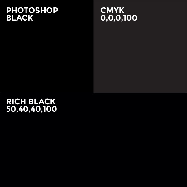
Open Photoshop and hit the D key to reset the foreground and background colours to their default values. Select the black that has been generated for you, it looks… black, right? Now look at the CMYK values that colours is made from, you’ll find 75% cyan, 68% magenta, 67% yellow and 90% black (300% total coverage). This is a lot of ink to put down on paper. Always manually set your black appropriately. This could be 0,0,0,100 for that crisp black for text, however this doesn’t look great when used as a background colour with it looking more like a dark grey than black. Instead you might opt for a “rich black”, of which there’s many recommendations, but 50,40,40,100 is a popular choice. This addition of other colours darkens the black to provide a much deeper colour, but it’s still well within the coverage limit.
READ MORE ABOUT DESIGNING WITH BLACK
KEEP AN EYE ON YOUR FONT AND LINE WEIGHTS

Those halftone screens in the printing press do a great job of controlling how much ink is placed onto the paper. They work by simply using a lower density of tiny dots in areas that don’t need much coverage. The trouble is you also lose detail when you try going too small, so tiny text and fine hairlines in your artwork are the first elements to become illegible. A limit of 6pt text size is the rule of thumb, but it all depends on the style of your typeface. Helvetica Ultra Light will probably disappear at much larger sizes due to its super fine lines! Keep this in mind when setting any small print within your designs.
SET THE CORRECT RESOLUTION
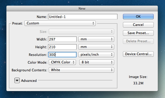
On your computer the resolution only really alters how large your image physically looks on screen, whereas in print resolution determines how sharp and crisp your designs will appear. 72ppi is the usual figure for web images, but in print 300ppi is the standard. The more dots or pixels you can put in every inch the more detail the overall image will retain when the image is reproduced in ink.
Make sure all your artwork is created at 300ppi, that includes all images and photography. If you happen to throw in a 72ppi image into your 300ppi working document it will appear tiny because it will be resized accordingly. You’re going to need massive images to fill most documents at 300ppi, so random images from the web just aren’t going to cut it.
You can’t scale a design up in resolution, so make sure you set the document size correctly to begin with to avoid having to start from scratch.
READ MORE ABOUT IMAGE RESOLUTIONS
DON’T FORGET THE BLEED
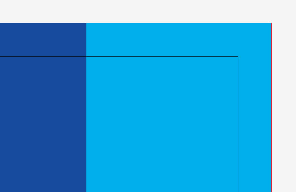
Resolution isn’t the only crucial factor when setting up a print design layout. You’ll also need to remember to accommodate for bleed. Bleed is an extra margin around the edge of your design where any background elements that touch the edge of the page are extended slightly. This allows for slight inaccuracies when the printed sheet is trimmed to size, so cutting through that buffer of colour will avoid leaving any thin white strips of paper along the edge of your print.
The actual amount of bleed you require will differ between print supplier and project, so be sure to select a printer beforehand and acquire their specs.
LEARN HOW TO SET BLEED IN YOUR PRINT DESIGNS
KERN, PROOFREAD AND SPELL CHECK
Typos suck! Despite proofreading this blog post there’s probably a couple of errors that still slipped past me. Fixing mistakes is easy on the web, but imagine how devastating it would be if you take delivery of your 5000 prints only to find a glaring error staring right back at you on every single one! Mistakes in print can’t be rectified, so take your time to check for ugly kerning, misuse of em/en dashes, curly quotes and the usual there/their/they’re errors that aren’t picked up by spell check. The image above is fake by the way… That would have sucked big time!
